
From Casual to Whale: 5 Key Lessons from Spending in AFK Journey
If you're a fan of hero collectors like AFK Journey and you're looking to spend, here's some insights into what happens when you pay your way to the top.

World of Warcraft: The War Within Alpha Hands-On Impressions
Robin had the opportunity to go hands on with the upcoming World of Warcraft expansion, The War Within. Here are our thoughts on our first hands-on with The Worldsoul Saga.

World of Warcraft: The War Within Alpha Developer Interview
As Blizzard gears up for the start of the public test for their next World of Warcraft expansion, The War Within, we had the chance to chat with two of the developers to learn more about the upcoming first chapter of the Worldsoul Saga.

Final Fantasy 14: How To Raise Your Item Level For Dawntrail
Here are the best ways to get your FFXIV level 90 gear up to a good item level.

Best TV Shows and Movies You Need to Watch as an MMORPG Player
With the recent success of Amazon's Fallout TV show, we considered the other video game adaptations--especially those with an MMO slant--we can recommend. Here are 11 of the best TV shows and movies every MMORPG player should check out.

Indie MMO Spotlight: A Short List of Indie Updates
This week, Wild Terra 2 received a major update, Zenith started Season 2, and Broken Ranks proves that p2w is alive and well.

MMO Launch Spotlight | A Huge Social Adventure MMO Tops Our List of Releases This Week
his week saw a number of MMO's hit Steam. A long-time peaceful cooperative social game made its way to a new platform, and a new indie PC MMO hitting the scene. Here's our shortlist of what launched this week.

The developers of Sea of Thieves have revealed that there is a cookbook in the works that takes all of its inspiration from in-game meals.

Alpha notes for The War Within offer a peek into some of the content and changes on the way in the next big World of Warcraft expansion.

There is no doubt that at the heart of it all, World of Warcraft is an MMORPG, but sometimes players don't have the time to sink into a full-fledged gameplay session with their friends and can fall behind. Luckily, Blizzard has taken note of that and has come up with a fix.

With preorder Founder's Editions open, Smite 2 is now detailing what Ascension Passes are, what you can earn with them, how to unlock God Mastery rewards, and more.

Get those fangs back out and be ready to feast on new enemies, as the V Rising gameplay trailer showcases a new endgame zone for players to traverse and enjoy.

More Pax Dei Alpha Details, End Time, and a New Community Q&A to Prepare, As Invites Start Going Out
Today, more than 100k invites for Pax Dei's Wilderness Alpha are going out. Mainframe has a few more details on the test and a new community dev Q&A video.

Pre-registration has officially expanded for Tarisland on PC and mobile. Those interested in the fantasy cross-platform MMORPG can sign up and qualify for some gifts and surprises at launch.

The Fallout IP has unsurprisingly seen a resurgence in excitement due to the positive reception of Amazon Prime's Fallout TV series, which is set in the same universe.

World of Warcraft vice president and executive producer Holly Longdale made brief comments about a potential console version of the now venerable MMO in a recent interview with VGC.

Larian Studios dropped its latest Baldur's Gate 3 community update this week, revealing details on the forthcoming Patch #7.

If you're a fan of hero collectors like AFK Journey and you're looking to spend, here's some insights into what happens when you pay your way to the top.

It's been a while since we've heard anything about team-based competitive PvP title, Project Loki, from Theorycraft Games. Today, the team has announced two major milestones, including the start of alpha and publishing deals in Asia and beyond.

Pax Dei's Wilderness Alpha will have more shards than originally planned, as invites are about to start going out.

Blizzard has revealed some interesting information on the new Warbands System coming to World of Warcraft The War Within, where we learn not only why they are coming but what perks they bring to the table.

Kingdom Come: Deliverance II, the follow up to Warhorse Studios' medieval RPG, has officially been announced today. The sequel to the 2018 RPG will release later this year on PC and consoles.

Millions of players have hopped in between the PC and mobile version to get in on the ground floor of the next big gacha hero collector. Should you join them?

Inkbound has come a long way, and it seems like the majority of Rise of the Unbound irons our the rough edges for new players. Read our full review to find out how!

Dragon's Dogma 2 delivers an immersive RPG adventure with its vast world and polished combat, complemented by a revamped Pawn system for enhanced camaraderie. With extensive character customization and dynamic gameplay, it stands as a masterclass in exploration and adventure.

Alone in the Dark is back after 30 years with a new vision for the legendary thriller. But how does this remake hold up? Here is our review.

It's been a couple weeks since our review in progress for Last Epoch, and it's been wild ride. Here is our full review of the APRG.

Zoria: Age of Shattering is a new CRPG from developer Tiny Trinket games, but how does this new RPG hold up? Check out in our review.

After a successful launch in 2022 on Steam, Warhammer 40,000: Chaos Gate - Daemonhunters made its way to consoles last week. Now you can pursue the demons of chaos with the illustrious Grey Knights on PC, Xbox, or PlayStation. If you've ever wanted to try XCOM with a side of Space Marines, now is your chance!

Inflexion Games' survival MMO Nightingale released into Early Access last week, and we've been putting it through its paces. How does the Gaslamp Fantasy survival game hold up in Early Access? Here is our review.

After years in development hell, Skull & Bones is a real video game you can play now. But how does it hold up? Check out our review.

Four years after the release of Final Fantasy VII REMAKE, Final Fantasy VII REBIRTH picks up the iconic story in the new trilogy. How does it stack up, and is this the first real game of the year contender for 2024? Read on in our review.

After almost five years in Steam Early Access, Eleventh Hour Games is finally releasing Last Epoch to the masses on Wednesday, February 21st. Here are our early impressions of the ARPG ahead of our full review.

After another week with Suicide Squad: Kill the Justice League, we're ready to pass final judgment. Check out our review.

Nick checked out Square Enix's Splatoon-like, Foamstars, on PlayStation 5, to see whether or not the casual, online-only shooter is up to snuff. Check out our review.

Lysfanga is Sand Door Studio's firs foray into gaming. Does this top-down action, hack and slasher go the distance?

In an industry where remakes and remasters are far from rare, Persona 3 Reload is an absolute masterclass on the idea.
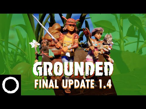
Grounded, Obsidian's Honey, I Shrunk The Kids-esque survival game, received its final content update this week with 'Fully Yoked' update 1.4.
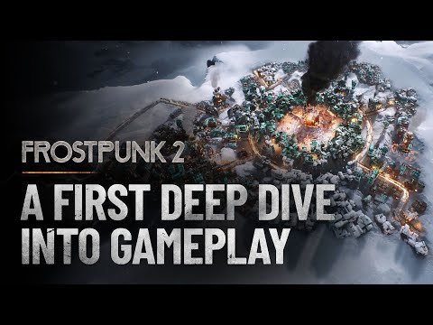
11 bit studios kicked off its beta for its post-apocalyptic city-builder, Frostpunk 2, this week for those who have pre-ordered the Deluxe Edition of the game. The beta runs through April 22.

Fallout 4 total conversion mod Fallout London is delayed indefinitely due to the imminent release of Fallout 4's next generation update.
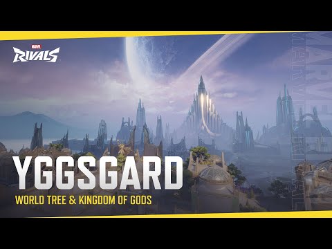
With the closed alpha for Marvel Rivals fast approaching, NetEase has released a new trailer showing off Yggsgard, one of the game's maps.
The indie roguelike deckbuilder that took the gaming world by storm in 2017 is finally getting a sequel. Mega Crit games revealed Slay the Spire 2 at the 2024 Triple-I Initiative's indie showcase.
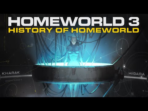
Gearbox Publishing and Blackbird Interactive released a new cinematic for Homeworld 3 earlier this week, hoping to catch players up on the series' story ahead of its release in May.
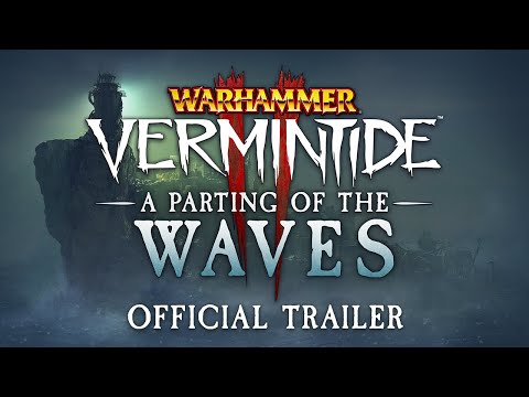
Fatshark is dropping a free new update for Warhammer: Vermintide 2 today. Titled 'A Parting of the Waves,' the update will set players off on an adventure that concludes the game's Karak Azgraz storyline.
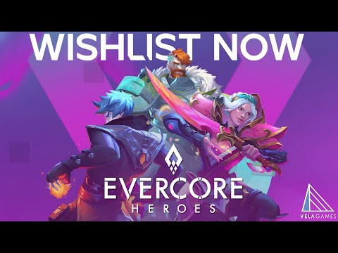
Evercore Heroes, a game developed by Riot, EA, and Rare veterans at Vela Games, has undergone a transformation.

Helldivers' democracy spreading arsenal is set to expand even further with the release of the new Democratic Detonation Warbond on April 11.
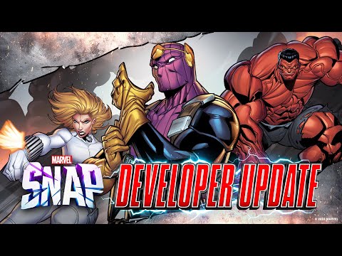
A new Marvel Snap season is upon us! The April 2024 season will focus on Marvel's antihero team the Thunderbolts with Baron Zemo featured as the season pass card.
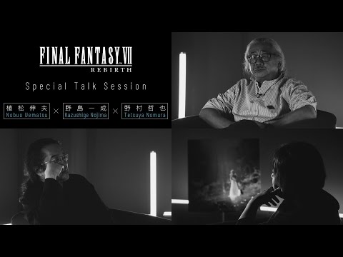
Square Enix recently published a 42 minute Final Fantasy VII Rebirth "Special Talk Session" on its Square Enix Music YouTube channel.
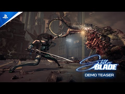
.The demo for Korean developer Shift Up's action-adventure game Stellar Blade is out now - for real this time.
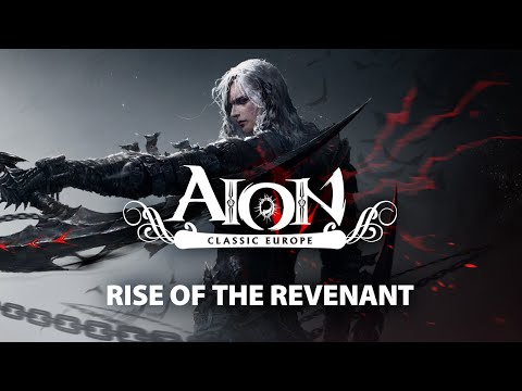
Update 2.7 has gone live for Aion Classic Europe, adding the new Revenant class, which is only available on Aion Classic servers.

No Man's Sky's latest update 'Orbital' is available today and adds ship customization, a new guild system, an overhaul to space stations, and more.
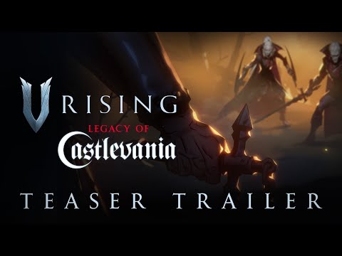
Stunlock Studios have announced a collaboration with Konami to feature "Legacy of Castlevania" content in its vampire survival ARPG, V Rising.

Wargaming and MMORPG.com have teamed up to give away 25 bonus item codes with in-game loot worth up to $50 to celebrate the MMO's 10-year anniversary.

Wargaming and MMORPG.com have teamed up to give away 25 bonus item codes with in-game loot worth up to $50 to celebrate the MMO's 10-year anniversary.

Wargaming and MMORPG.com have teamed up to give away a PlayStation 5 Slim to celebrate the ten-year anniversary of World of Tanks: Modern Armor!

World of Warships and MMORPG.com have teamed up to give away some digital goodies for the holidays! This single-use code will work for both new and existing players of Wargaming's Warship MMO

Mainframe Industries, New Tales and MMORPG.com have teamed up to give away 40 alpha codes to Pax Dei's first major alpha test, the Home Valley test, which starts November 14th and runs through the 27th.

Daybreak Games and MMORPG.com have teamed up to give away 15 copies of Dungeons & Dragons Online: Vecna Unleashed Ultimate Edition.

Neverwinter has teamed up with MMORPG.com to give ten readers a new mount to celebrate the recent launch of the Demonweb Pits module.

Neverwinter has teamed up with MMORPG.com to give ten readers a new mount to celebrate the recent launch of the Demonweb Pits module.

Neverwinter has teamed up with MMORPG.com to give ten readers a new mount to celebrate the recent launch of the Demonweb Pits module.

Reedpop and MMORPG.com have teamed up to give five (5) passes to the upcoming PAX West convention in Seattle, Washington. These passes are the full weekend (4-day) passes, giving you access to one of the largest gaming conventions in North America.

Cryptic Studios and MMORPG.com have teamed up to give one lucky reader a care package including a Menzoberranzan Razer Barracuda X headset, exclusive dragon sketch from a renowned D&D artist and much more to celebrate the MMO's 10th Birthday!

Stunlock Studios and MMORPG.com have teamed up to giveaway 30 copies of V Risings Sinister Evolution DLC pack to help budding Vampires on their survival journey. Enter to win here!

V Rising and MMORPG.com have teamed up to give away 30 full copies of the vampire-flavored survival game.

Cryptic Studios and MMORPG.com have teamed up to give away 200 cosmetic codes granting players a new Arachnoid Wrap to don during their adventures in the Underdark.

Cryptic Studios and MMORPG.com have teamed up to give away 150 cosmetic codes granting Neverwinter players a new Arachnoid Wrap to don during their adventures in the Underdark.
![[Very Hard] Smooth Brotha in Space | Matching gift subs today!| !SUBTEMBER IS LIVE! #AmdRedTeam](https://static-cdn.jtvnw.net/previews-ttv/live_user_techniq-350x200.jpg)