
10 Beginner Tips I Wish I Knew Before I Started Helldivers 2
Helldivers 2 is one of the most successful game releases of 2024, and it is by far one of the best live service models in the games industry. If you are planning to get Helldivers 2, here are ten beginner tips that will help you out.

Destiny 2: The Final Shape Wants to Close The Curtains With A Bang
Bungie gave players a first look at Destiny 2: The Final Shape's gameplay and a lot of players were blown away by what the developers have been cooking. Kanishka breaks it down and looks ahead to the future of the live service shooter.

Indie MMO Spotlight: Indie MMOs Rise From The Dead
This week, Legends of Aria Classic (image above) rises from the ashes, Broken Ranks finishes its gear rework, and The Quinfall sends out invites to its next Closed Beta.

MMO Launch Spotlight | An MMORTS and A Naughty VR Pool Party Make Our List of 5 This Week
This week we see an old game return to some negative reviews and a VR social pool party leaves Early Access. Don't miss out!

From Casual to Whale: 5 Key Lessons from Spending in AFK Journey
If you're a fan of hero collectors like AFK Journey and you're looking to spend, here's some insights into what happens when you pay your way to the top.

World of Warcraft: The War Within Alpha Hands-On Impressions
Robin had the opportunity to go hands on with the upcoming World of Warcraft expansion, The War Within. Here are our thoughts on our first hands-on with The Worldsoul Saga.

World of Warcraft: The War Within Alpha Developer Interview
As Blizzard gears up for the start of the public test for their next World of Warcraft expansion, The War Within, we had the chance to chat with two of the developers to learn more about the upcoming first chapter of the Worldsoul Saga.

HoYoverse has announced that pre-registrations for the upcoming ARPG Zenless Zone Zero are now open for all platforms.

There are so many things coming to World of Warcraft over the next few months, including the final chapter of the Dragonflight expansion, Dark Heart, Mists of Pandaria remix, and WoW Classic: Cataclysm.

Dragonflight Season 4 is now live in World of Warcraft, both making some big changes and new improvements, while also winding the era down before The War Within.

Sky: Children of the Light is launching a new collaboration with Sanrio's Cinnamoroll. One of the company's classic characters, the cute puppy will head into Sky for a three-week event.

After weeks of reveals, announcements, how-tos, and finally, more than 100k invites, the Pax Dei Wilderness Alpha is live.

Helldivers 2 is one of the most successful game releases of 2024, and it is by far one of the best live service models in the games industry. If you are planning to get Helldivers 2, here are ten beginner tips that will help you out.

Funcom is teasing PvP in Dune: Awakening and letting us all know the importance of staying hydrated on Arrakis with a fun side game.

Palia developer Singularity 6 announced today a new spring themed content update for the game.

Embers Adrift is working on some potential shifts that could help improve the player experience, make grouping easier, and make the availability of content and something to do more consistent.

Last week, Hanbyeol Oh, A.K.A. Inkwell, released a pleasantly surprising announcement concerning Maplestory Global after outcry over changes to the Korean version of the MMO.

EVE Online's next expansion, Equinox, has been announced, bringing new Upwell Consortium structures, including a futuristic space elevator called a Skyhook, a moon miner, and more.
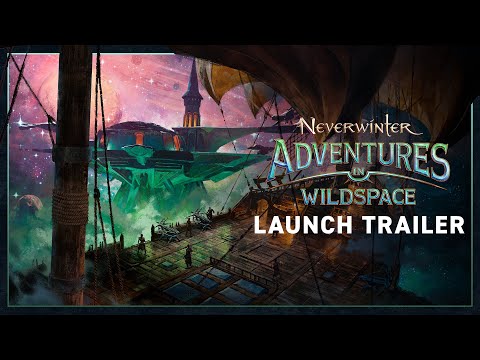
Neverwinter's latest module, Adventures in Wildspace, is out now. The module concludes the game's Spelljammer story arc, expands the Wildspace adventure zone, a new dungeon, some quality-of-life improvements, and more.

Not all new things bring positive reviews, as Blizzard learned with the latest Plunderstorm Batlle Royale game mode they introduced to World of Warcraft Dragonflight. Despite the negative response, Blizzard says they won't stop experimenting with new things.

With the release of the Fallout TV series, it appears the nostalgic feel of the show has brought many players back to the Fallout games, and this has put a major strain on the game's biggest mod site, Nexus Mods.

Skull and Bones is headed into the final phase of Season 1, Raging Tides. The Ubisoft Singapore team has a new update with fixes and reward details.

Millions of players have hopped in between the PC and mobile version to get in on the ground floor of the next big gacha hero collector. Should you join them?

Inkbound has come a long way, and it seems like the majority of Rise of the Unbound irons our the rough edges for new players. Read our full review to find out how!

Dragon's Dogma 2 delivers an immersive RPG adventure with its vast world and polished combat, complemented by a revamped Pawn system for enhanced camaraderie. With extensive character customization and dynamic gameplay, it stands as a masterclass in exploration and adventure.

Alone in the Dark is back after 30 years with a new vision for the legendary thriller. But how does this remake hold up? Here is our review.

It's been a couple weeks since our review in progress for Last Epoch, and it's been wild ride. Here is our full review of the APRG.

Zoria: Age of Shattering is a new CRPG from developer Tiny Trinket games, but how does this new RPG hold up? Check out in our review.

After a successful launch in 2022 on Steam, Warhammer 40,000: Chaos Gate - Daemonhunters made its way to consoles last week. Now you can pursue the demons of chaos with the illustrious Grey Knights on PC, Xbox, or PlayStation. If you've ever wanted to try XCOM with a side of Space Marines, now is your chance!

Inflexion Games' survival MMO Nightingale released into Early Access last week, and we've been putting it through its paces. How does the Gaslamp Fantasy survival game hold up in Early Access? Here is our review.

After years in development hell, Skull & Bones is a real video game you can play now. But how does it hold up? Check out our review.

Four years after the release of Final Fantasy VII REMAKE, Final Fantasy VII REBIRTH picks up the iconic story in the new trilogy. How does it stack up, and is this the first real game of the year contender for 2024? Read on in our review.

After almost five years in Steam Early Access, Eleventh Hour Games is finally releasing Last Epoch to the masses on Wednesday, February 21st. Here are our early impressions of the ARPG ahead of our full review.

After another week with Suicide Squad: Kill the Justice League, we're ready to pass final judgment. Check out our review.

Nick checked out Square Enix's Splatoon-like, Foamstars, on PlayStation 5, to see whether or not the casual, online-only shooter is up to snuff. Check out our review.

Lysfanga is Sand Door Studio's firs foray into gaming. Does this top-down action, hack and slasher go the distance?

In an industry where remakes and remasters are far from rare, Persona 3 Reload is an absolute masterclass on the idea.
Neverwinter's latest module, Adventures in Wildspace, is out now. The module concludes the game's Spelljammer story arc, expands the Wildspace adventure zone, a new dungeon, some quality-of-life improvements, and more.
It's been over a decade since 7 Days to Die entered Steam Early Access, but the game's developer, The Fun Pimps, finally feels its ready for its official 1.0 release.
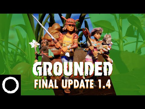
Grounded, Obsidian's Honey, I Shrunk The Kids-esque survival game, received its final content update this week with 'Fully Yoked' update 1.4.
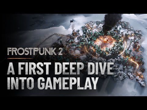
11 bit studios kicked off its beta for its post-apocalyptic city-builder, Frostpunk 2, this week for those who have pre-ordered the Deluxe Edition of the game. The beta runs through April 22.

Fallout 4 total conversion mod Fallout London is delayed indefinitely due to the imminent release of Fallout 4's next generation update.
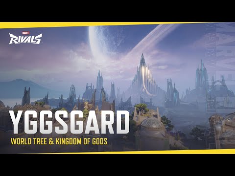
With the closed alpha for Marvel Rivals fast approaching, NetEase has released a new trailer showing off Yggsgard, one of the game's maps.
The indie roguelike deckbuilder that took the gaming world by storm in 2017 is finally getting a sequel. Mega Crit games revealed Slay the Spire 2 at the 2024 Triple-I Initiative's indie showcase.
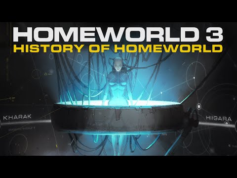
Gearbox Publishing and Blackbird Interactive released a new cinematic for Homeworld 3 earlier this week, hoping to catch players up on the series' story ahead of its release in May.
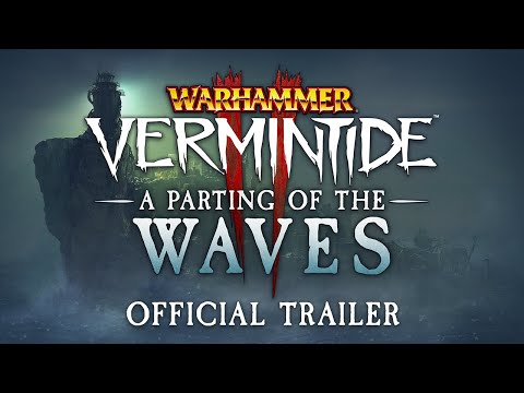
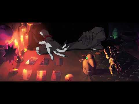
Fatshark is dropping a free new update for Warhammer: Vermintide 2 today. Titled 'A Parting of the Waves,' the update will set players off on an adventure that concludes the game's Karak Azgraz storyline.
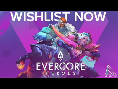
Evercore Heroes, a game developed by Riot, EA, and Rare veterans at Vela Games, has undergone a transformation.

Helldivers' democracy spreading arsenal is set to expand even further with the release of the new Democratic Detonation Warbond on April 11.
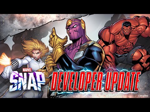
A new Marvel Snap season is upon us! The April 2024 season will focus on Marvel's antihero team the Thunderbolts with Baron Zemo featured as the season pass card.

Square Enix recently published a 42 minute Final Fantasy VII Rebirth "Special Talk Session" on its Square Enix Music YouTube channel.
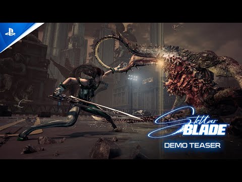
.The demo for Korean developer Shift Up's action-adventure game Stellar Blade is out now - for real this time.
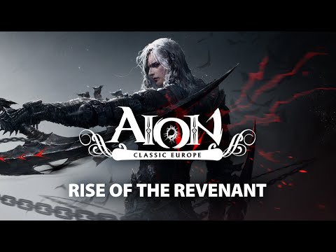
Update 2.7 has gone live for Aion Classic Europe, adding the new Revenant class, which is only available on Aion Classic servers.

Wargaming and MMORPG.com have teamed up to give away 25 bonus item codes with in-game loot worth up to $50 to celebrate the MMO's 10-year anniversary.

Wargaming and MMORPG.com have teamed up to give away 25 bonus item codes with in-game loot worth up to $50 to celebrate the MMO's 10-year anniversary.

Wargaming and MMORPG.com have teamed up to give away a PlayStation 5 Slim to celebrate the ten-year anniversary of World of Tanks: Modern Armor!

World of Warships and MMORPG.com have teamed up to give away some digital goodies for the holidays! This single-use code will work for both new and existing players of Wargaming's Warship MMO

Mainframe Industries, New Tales and MMORPG.com have teamed up to give away 40 alpha codes to Pax Dei's first major alpha test, the Home Valley test, which starts November 14th and runs through the 27th.

Daybreak Games and MMORPG.com have teamed up to give away 15 copies of Dungeons & Dragons Online: Vecna Unleashed Ultimate Edition.

Neverwinter has teamed up with MMORPG.com to give ten readers a new mount to celebrate the recent launch of the Demonweb Pits module.

Neverwinter has teamed up with MMORPG.com to give ten readers a new mount to celebrate the recent launch of the Demonweb Pits module.

Neverwinter has teamed up with MMORPG.com to give ten readers a new mount to celebrate the recent launch of the Demonweb Pits module.

Reedpop and MMORPG.com have teamed up to give five (5) passes to the upcoming PAX West convention in Seattle, Washington. These passes are the full weekend (4-day) passes, giving you access to one of the largest gaming conventions in North America.

Cryptic Studios and MMORPG.com have teamed up to give one lucky reader a care package including a Menzoberranzan Razer Barracuda X headset, exclusive dragon sketch from a renowned D&D artist and much more to celebrate the MMO's 10th Birthday!

Stunlock Studios and MMORPG.com have teamed up to giveaway 30 copies of V Risings Sinister Evolution DLC pack to help budding Vampires on their survival journey. Enter to win here!

V Rising and MMORPG.com have teamed up to give away 30 full copies of the vampire-flavored survival game.

Cryptic Studios and MMORPG.com have teamed up to give away 200 cosmetic codes granting players a new Arachnoid Wrap to don during their adventures in the Underdark.

Cryptic Studios and MMORPG.com have teamed up to give away 150 cosmetic codes granting Neverwinter players a new Arachnoid Wrap to don during their adventures in the Underdark.
![[Very Hard] Smooth Brotha in Space | Matching gift subs today!| !SUBTEMBER IS LIVE! #AmdRedTeam](https://static-cdn.jtvnw.net/previews-ttv/live_user_techniq-350x200.jpg)